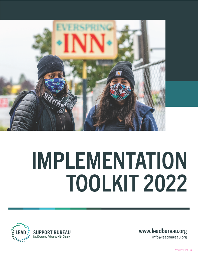
LEAD: let everyone advance with dignity
roles
Brand Identity · Web Design · UI/UX · Iconography · Toolkit · Slide Deck Templates · Print · Wireframingclient
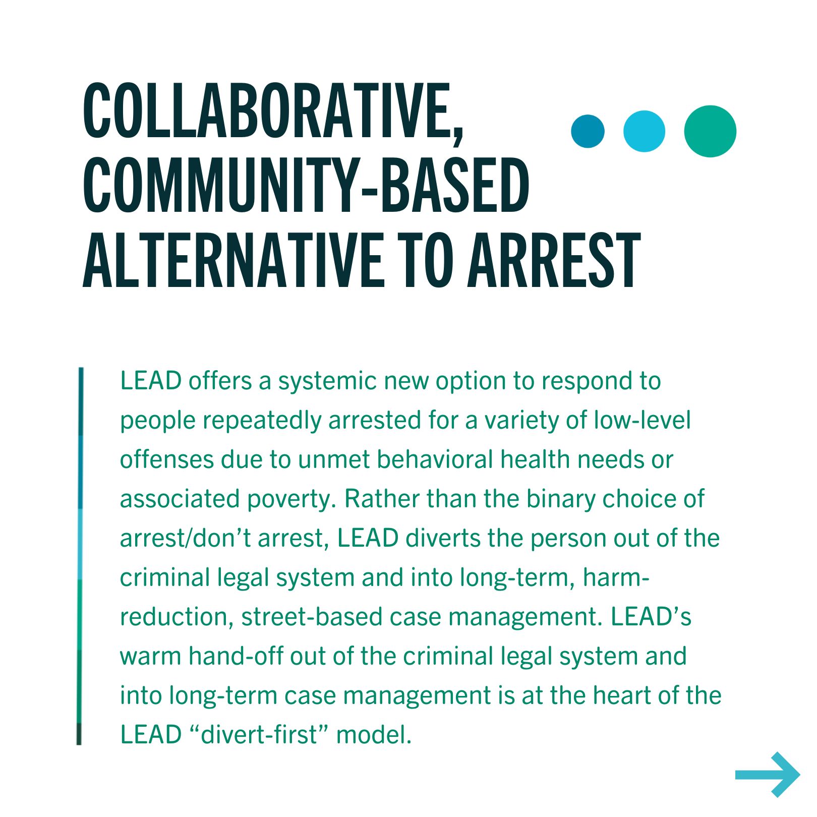
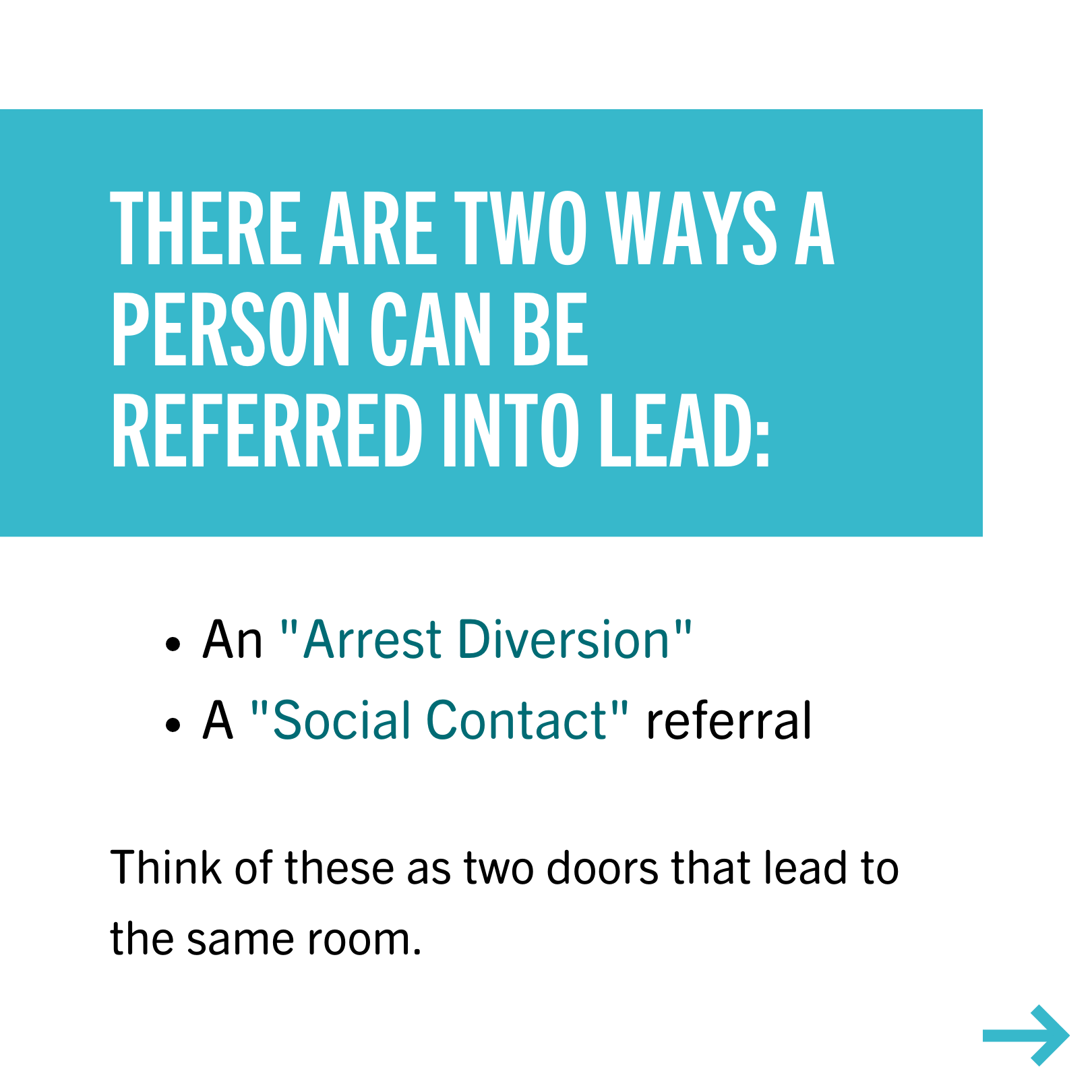
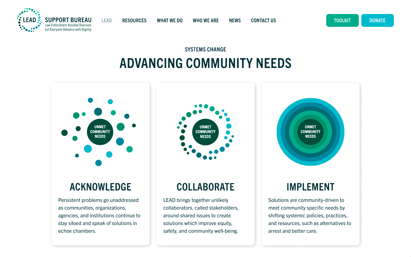
LEAD (Let Everyone Advance with Dignity) is a framework as well as a national network of teams and stakeholders navigating restorative justice through building a non-punitive, community-based system of response. LEAD’s purpose is to change systems by shifting systemic policies, practices, and resources, such as alternatives to arrest and better care.
team
As a graphic designer, I worked with a team consisting of an art director, a UX designer, copywriters, project managers, and developers. We communicated through Slack and used Asana for project management.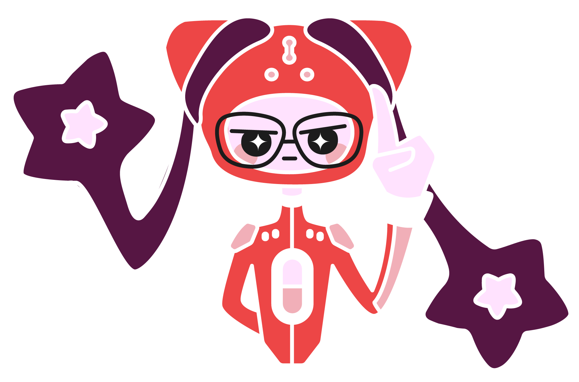
objectives
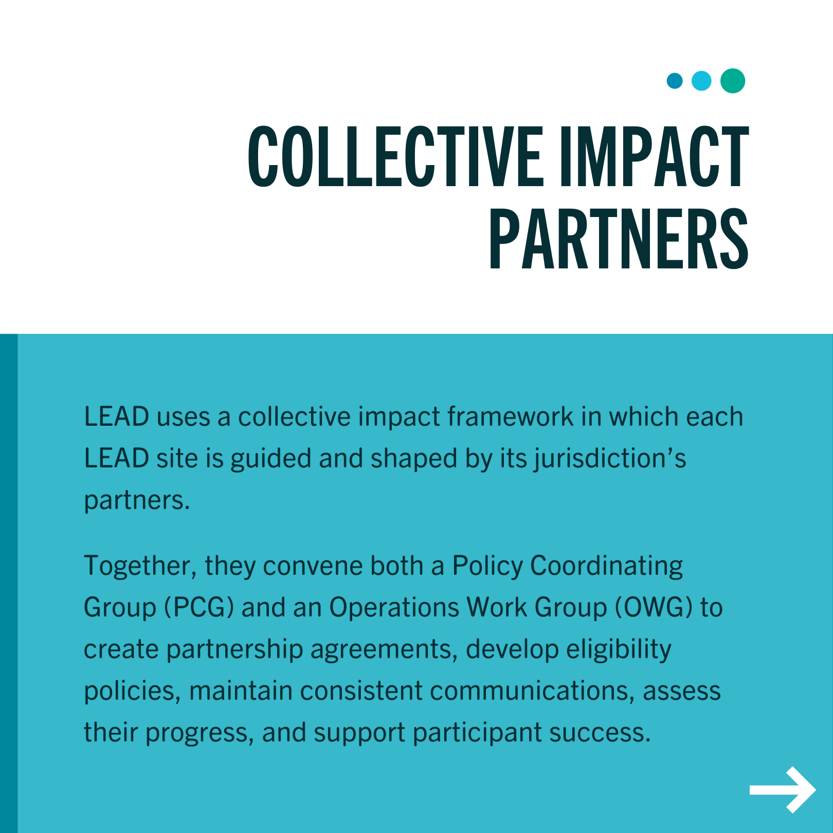
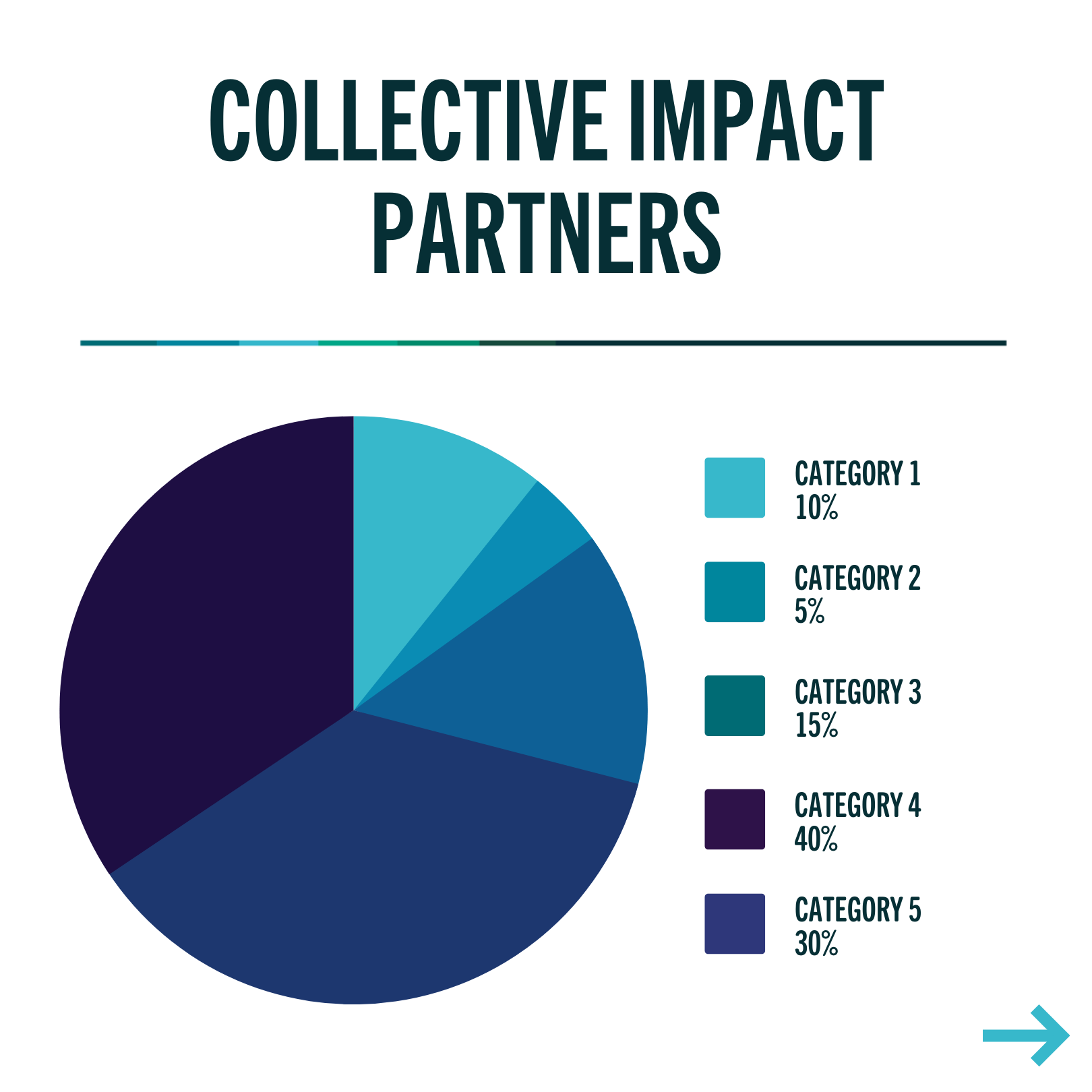
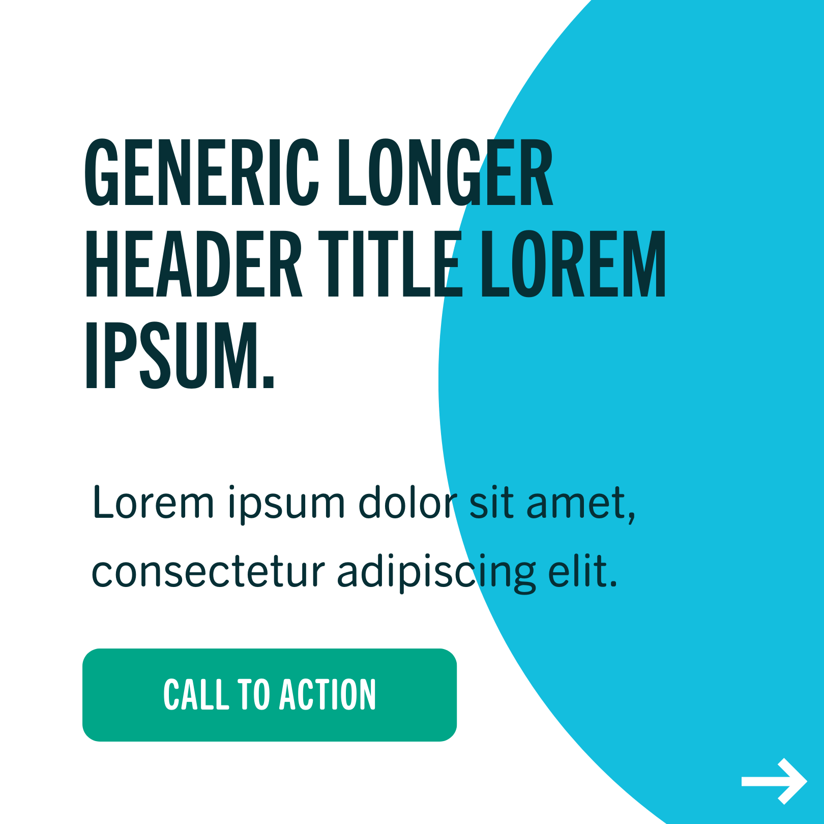
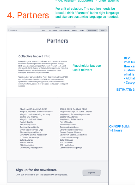
We worked closely with the national branch—the LEAD Support Bureau (LSB)—along with their sister sites in Seattle, Albany, Ithaca, Allegheny, Pittsburgh, and Baltimore to develop a brand identity and messaging that continued the nuanced differences between each site yet encompassed the full LEAD framework that prioritizes systemic change.Slide Decks & Templates
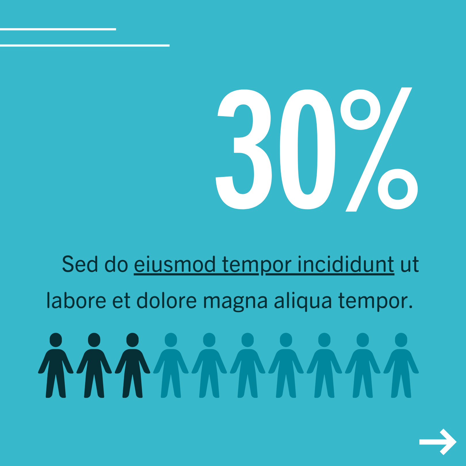
Social Media Templates
Poster
Social Media Templates
Poster
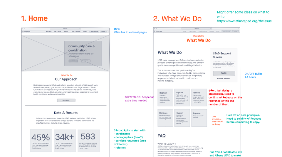
website in a box
objectives
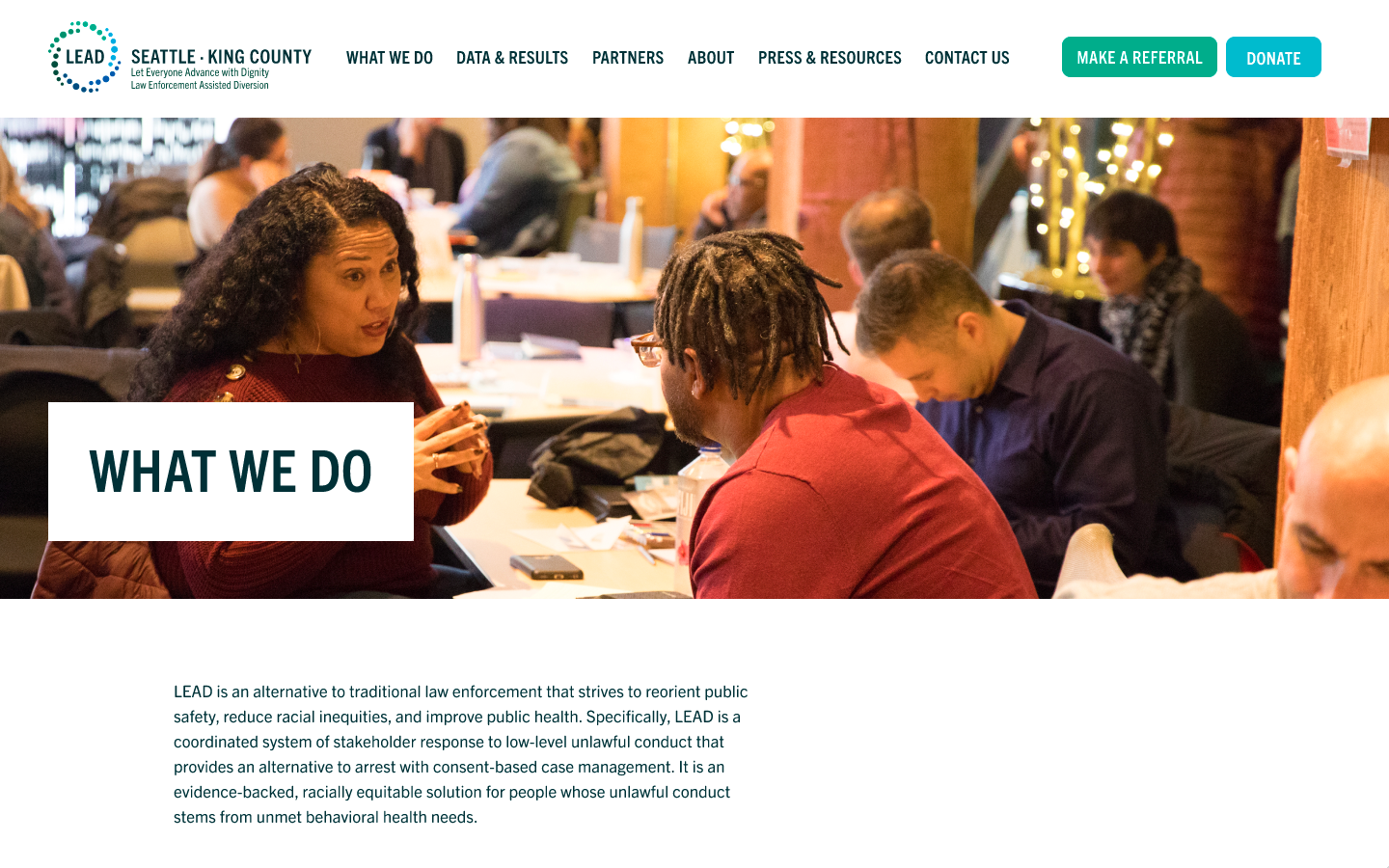
Website in a Box, or WIAB, is a project in which design and development collaborate to create a branded website template that can be replicated for existing and upcoming LEAD sites. I used InVision for wireframing and Figma for design.The user we designed for are the people working in these LEAD sites who are setting up a location-specific website for the first time or are updating existing content. The user should be able to simply plug copy and have the ability to easily edit images, including hero images and newsletter post thumbnails.
The user may have the task of continually updating the press and resources or any other copy on the site while having little to no skill in design or web development.

wireframing
pains
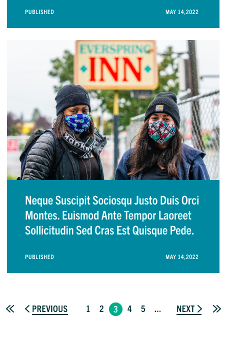
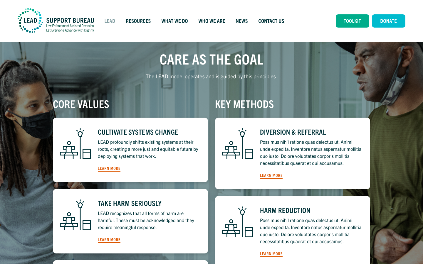
The difficulty in this project for me was my inexperience with designing from different perspectives. Luckily, my more experienced teammates such as the UX Designer and Art Director were able to provide feedback from a user and development standpoint.One area where this manifested was I had not considered image quality while wireframing. My intial designs implemented lots of photography since LEAD leans upon being community-oriented and seeing LEAD case managers talking face to face with their clients would indicate a more direct, street approach which was their mission.
However, we had to keep in mind that these smaller and newer sites may not have access to high resolution photography. This meant that some newer LEAD sites could have hero images that appear pixelated if the hero image was designed to take up the entire page. Another perspective is a new LEAD site could have so little photography to fill their website that the empty layout would affect the website’s impact to a new user. On the development side, too many images would also impact load time.


problems
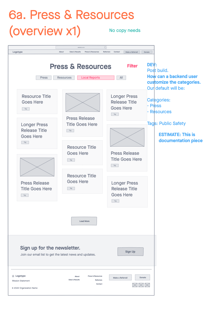
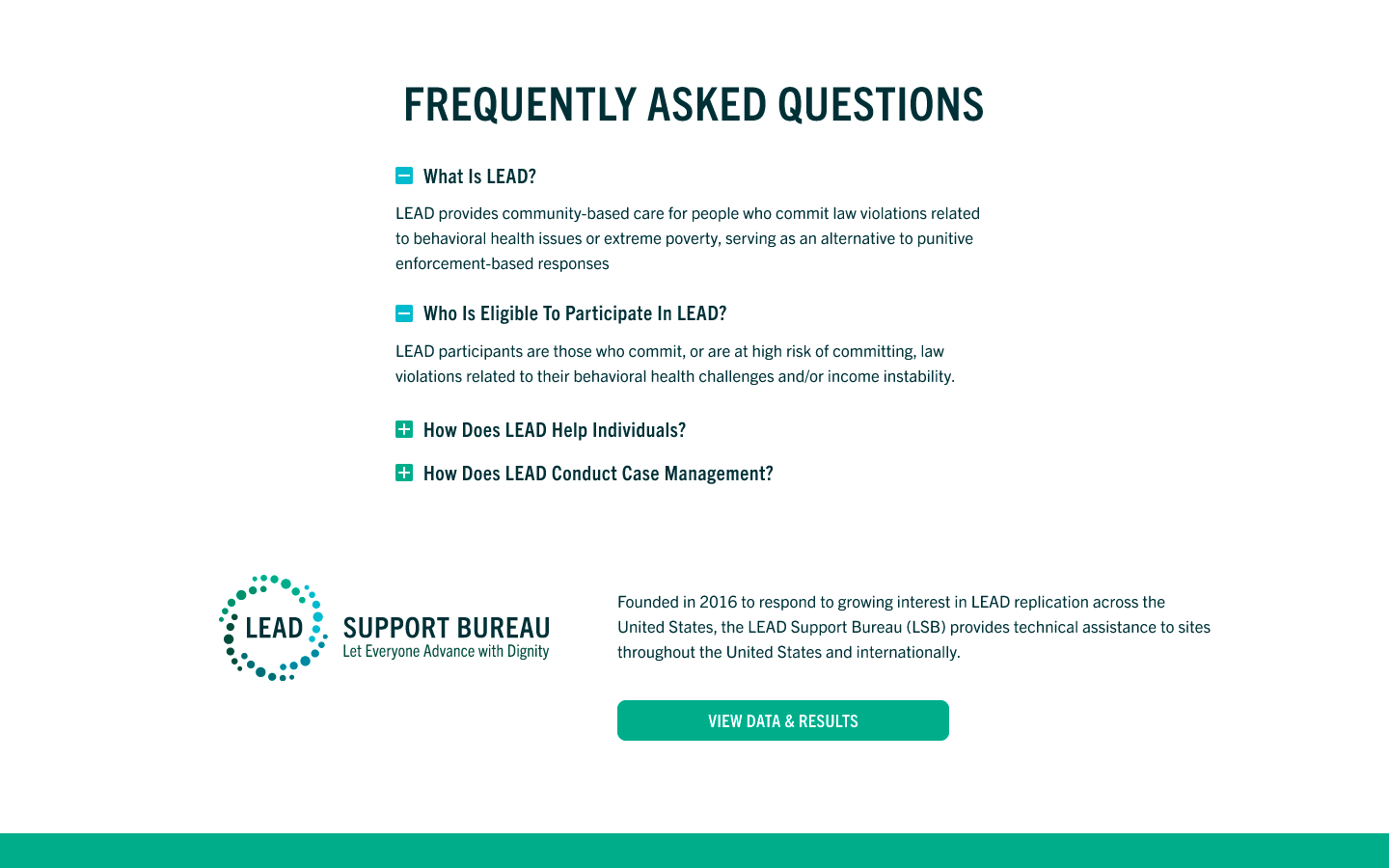
One of the more difficult pages to design for was the Press & Resources page. There were many questions we had to propose before sending it off to the client from a development standpoint that a client would not be able to consider during revision.How would these posts populate? Would we design for an endless scroll or pagination? How would either option be affected by whether or not a user uploads an image for the post? How do we create tags, and how would a user be able to see only the tags they want to see?
This ultimately saves budget and time for the entire team, which exemplified to me the importance of understanding basic development and how a designer can incorporate that knowledge as early as the wireframing stage.
solutions
The solution was to be strategic with image placement and layout composition, which is where grids came into play. Though it sounds obvious to more experienced designers, I hadn’t realized how important grids were until starting this project. Grid systems are the foundation of a design, and it is especially apparent through web design. Though spacing seems to be intuitive, having guidelines and precise consistencies are ultimately what make a design production-ready for the client.
Though there were a plethora of skills I learned through this project, the biggest learning opportunities came with seeing through the lens of the user and development, which sparked my interest to study front-end web development and UX design to improve workflow efficiency when collaborating in a cross-functional team.
︎︎︎ View Live Site (2023)


lsb home page

objectives
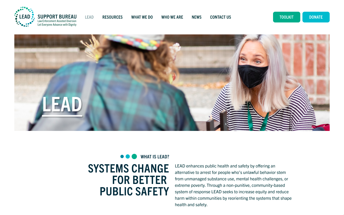
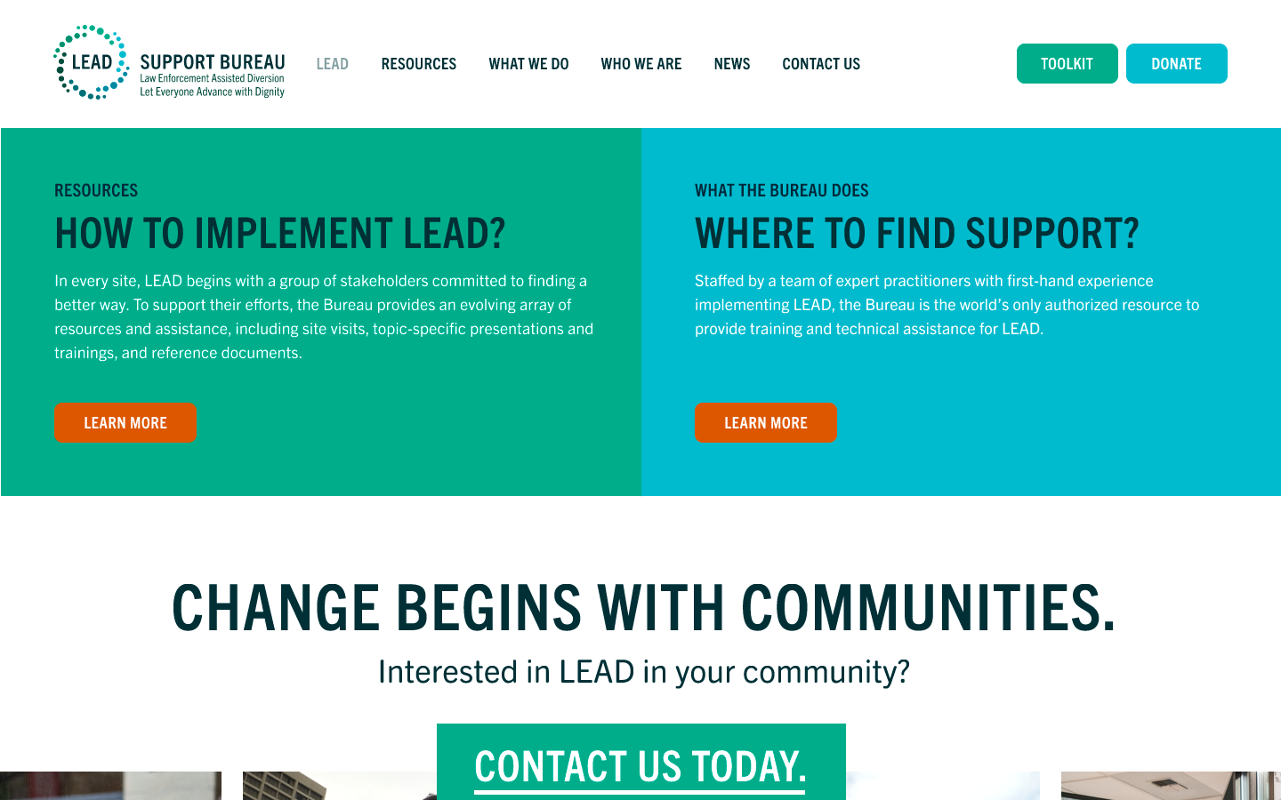
My role in the project was to wireframe and design the LEAD Support Bureau home page which developed the grids underlying the layout to utilize throughout the rest of the website.︎︎︎ View Live Site (2023)
toolkit pdf
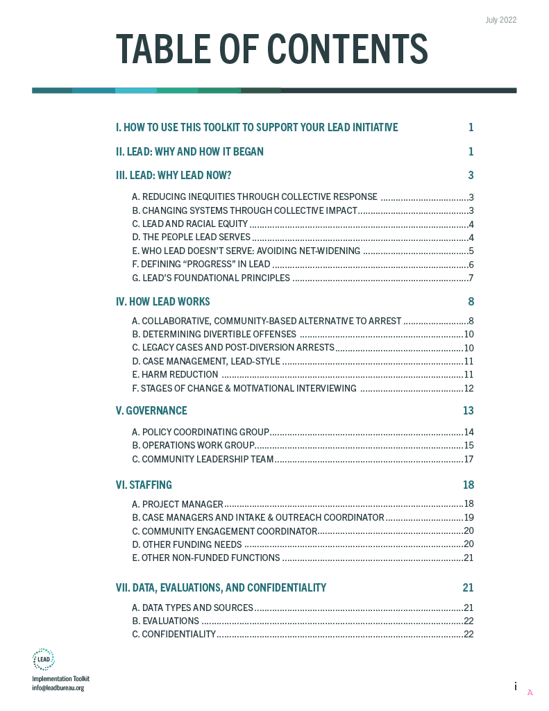


objectives
My objective as the designer was to create the grid, layout, and spacing systems to use throughout the brand. I worked with the art director and client to find how we would utilize the color scheme, composition layout, spacing proportions, and graphic elements such as the branded bar throughout different projects.The Toolkit served as a reference for the majority of the branding guidelines including the social media templates, slide deck templates, printed poster, and the earlier stages of WIAB and the LSB home page.
︎︎︎ Download LEAD Implementation Toolkit 2022
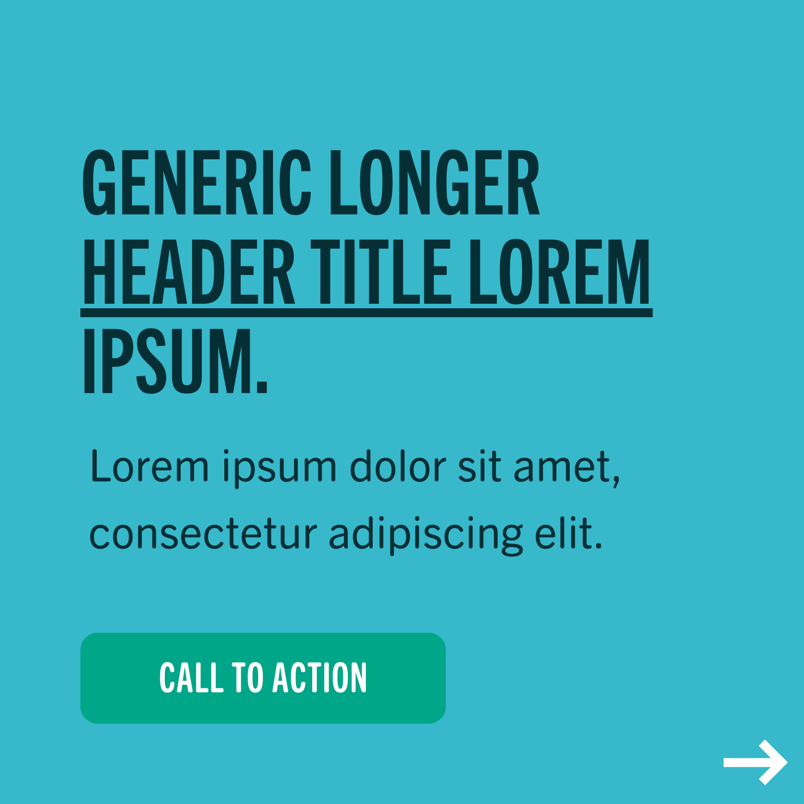
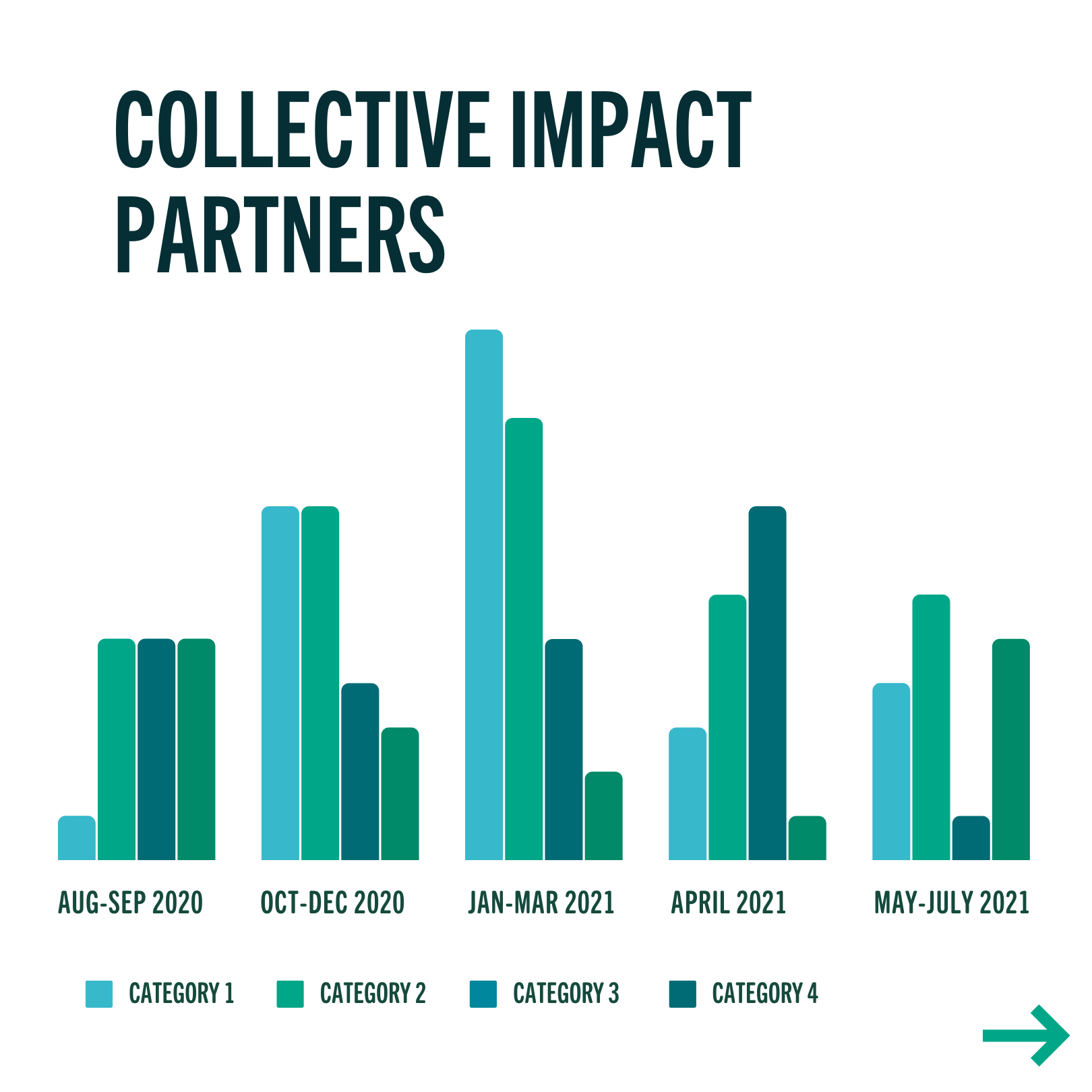
slide deck template


social media template